Quick Introduction to ggplot2
Data visualization is the presentation of data in a pictorial or graphical format. It enables decision makers to see analytics presented visually, so they can grasp difficult concepts or identify new patterns. With interactive visualization, you can take the concept a step further by using technology to drill down into charts and graphs for more detail, interactively changing what data you see and how it’s processed.
ggplot2 -A short Explanation
ggplot2 is a data visualization package for the statistical programming language R. Created by Hadley Wickham in 2005, ggplot2 is an implementation of Leland Wilkinson's Grammar of Graphics—a general scheme for data visualization which breaks up graphs into semantic components such as scales and layers.
Lets visualize the data using ggplot2 with a couple of ggplot commands using the Iris dataset.Lets have a look on the header of the dataset


Here using the following R code we can find the relationship between Sepal.length and Petal.Length
qplot(Sepal.Length, Petal.Length, data = iris, color = Species)

qplot(Sepal.Length, Petal.Length, data = iris)


qplot(Sepal.Length, Petal.Length, data = iris, color = Species, size = Petal.Width, alpha = I(0.7))

qplot(Sepal.Length, Petal.Length, data = iris, color = Species,xlab = "Sepal Length", ylab = "Petal Length", main = "Sepal vs. Petal Length in Fisher's Iris data")

qplot(Sepal.Length, Petal.Length, data = iris, geom = "point")
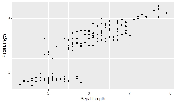
qplot(Sepal.Length, Petal.Length, data = iris)

movies = data.frame(director = c("spielberg", "spielberg", "spielberg", "jackson", "jackson"),
movie = c("jaws", "avatar", "schindler's list", "lotr", "king kong"),
minutes = c(124, 163, 195, 600, 187))

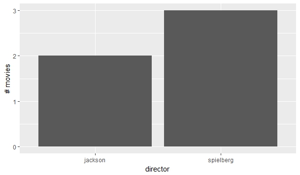
Ploting the number of movies each director has.
qplot(director, data = movies, geom = "bar", ylab = "# movies")
Here the height of each bar is the total running time of the director's movies.
qplot(director, weight = minutes, data = movies, geom = "bar", ylab = "total length (min.)"


ok
ReplyDelete