BASIC VISUALIZATIONS
- Basic graphs in R can be created quite easily. The plot command is the command to note.
- It takes in many parameters from x axis data , y axis data, x axis labels, y axis labels, color and title. To create line graphs, simply use the parameter, type=l.
- If you want a boxplot, you can use the word boxplot, and for barplot use the barplot function.
Basic Visualization which we are going to perform here
- Histogram
- Bar / Line Chart
- Box plot
- Scatter plo
1. Histogram
Histogram is basically a plot that breaks the data into bins (or breaks) and shows frequency distribution of these bins. You can change the breaks also and see the effect it has data visualization in terms of understandability.
Let me give you an example.
Note: We have used par(mfrow=c(2,5)) command to fit multiple graphs in same page for sake of clarity( see the code below).
The following commands show this in a better way. In the code below, the main option sets the Title of Graph and the col option calls in the color pallete from RColorBrewer to set the colors.
library(RColorBrewer)
data(VADeaths)
par(mfrow=c(2,3))
hist(VADeaths,breaks=10, col=brewer.pal(3,"Set3"),main="Set3 3 colors")
hist(VADeaths,breaks=3 ,col=brewer.pal(3,"Set2"),main="Set2 3 colors")
hist(VADeaths,breaks=7, col=brewer.pal(3,"Set1"),main="Set1 3 colors")
hist(VADeaths,,breaks= 2, col=brewer.pal(8,"Set3"),main="Set3 8 colors")
hist(VADeaths,col=brewer.pal(8,"Greys"),main="Greys 8 colors")
hist(VADeaths,col=brewer.pal(8,"Greens"),main="Greens 8 colors")
2. Bar/ Line Chart
Line Chart
Below is the line chart showing the increase in air passengers over given time period. Line Charts are commonly preferred when we are to analyse a trend spread over a time period. Furthermore, line plot is also suitable to plots where we need to compare relative changes in quantities across some variable (like time). Below is the code:
plot(AirPassengers,type="l") #Simple Line Plot
plot(AirPassengers,type="l") #Simple Line Plot
Bar Plots are suitable for showing comparison between cumulative totals across several groups. Stacked Plots are used for bar plots for various categories. Here’s the code:
barplot(iris$Sepal.Length,col = brewer.pal(3,"Set1"))
barplot(table(iris$Species,iris$Sepal.Length),col = brewer.pal(3,"Set1")) #Stacked Plot
3. Box Plot ( including group-by option )
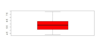
Box Plot shows 5 statistically significant numbers- the minimum, the 25th percentile, the median, the 75th percentile and the maximum. It is thus useful for visualizing the spread of the data is and deriving inferences accordingly. Here’s the basic code:boxplot(iris$Petal.Length~iris$Species) #Creating Box Plot between two variableLet’s understand the code below:In the example below, I have made 4 graphs in one screen. By using the ~ sign, I can visualize how the spread (of Sepal Length) is across various categories ( of Species). In the last two graphs I have shown the example of color palettes. A color palette is a group of colors that is used to make the graph more appealing and helping create visual distinctions in the data.data(iris)
par(mfrow=c(2,2))
boxplot(iris$Sepal.Length,col="red")
boxplot(iris$Sepal.Length~iris$Species,col="red")
boxplot(iris$Sepal.Length~iris$Species,col=heat.colors(3))
boxplot(iris$Sepal.Length~iris$Species,col=topo.colors(3))
4. Scatter Plot (including 3D and other features)
Scatter plots help in visualizing data easily and for simple data inspection. Here’s the code for simple scatter and multivariate scatter plot:
plot(x=iris$Petal.Length) #Simple Scatter Plot
plot(x=iris$Petal.Length,y=iris$Species) #Multivariate Scatter PlotScatter Plot Matrix can help visualize multiple variables across each other.plot(iris,col=brewer.pal(3,"Set1"))


No comments:
Post a Comment