Data Visualization Lab
Friday, 17 February 2017
Thursday, 16 February 2017
Session 6: Plotting addresses on Google Maps using R and R Google Maps
Plotting Addresses on Google Maps using R and R GoogleMaps
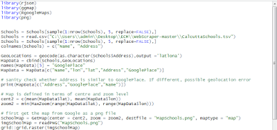
In an earlier post, we had shown how locations as defined by addresses could be plotted on Google Maps but the process was rather complicated. First, the geocoding had to be done separately and secondly a lot of messy Javascript had to be coded by hand. Finally the map that was produced could only be viewed with an internet connection.


Wednesday, 1 February 2017
Session 6 :Visualization : Using R for Maps of India - state, district, taluka level maps
Using R for Maps of India - state, district, taluka level maps
Displaying spatial data on maps is always interesting but most Visualisation tools do not offer facilities to create maps of India, especially at the state and lower levels. In this post, we will show how such maps can be made.The base data for such maps, the "polygons" that define the country, the states, the districts and even the talukas ( or sub-divisions) is available from an organisation called Global Administrative Areas or gadm.org. Country level files for almost all countries are available in a variety of formats including R and these are at three different levels. For India, these files can be downloaded as IND_admN.RData where N = 1,2,3. These will form the raw data from which we will create our maps.
Monday, 30 January 2017
Session 7 :Visualization : Python /Seaborne Multiple Linear Regression
Seaborn: statistical data visualization
Seaborn is a Python visualization library based on matplotlib. It provides a high-level interface for drawing attractive statistical graphics.
Seaborn is a library for making attractive and informative statistical graphics in Python. It is built on top of matplotlib and tightly integrated with the PyData stack, including support for numpy and pandas data structures and statistical routines from scipy and statsmodels.
Some of the Features that seaborn offer are
- Several built-in themes that improve on the default matplotlib aesthetics
- Tools for choosing color palettes to make beautiful plots that reveal patterns in your data
- Functions for visualizing univariate and bivariate distributions or for comparing them between subsets of data
- Tools that fit and visualize linear regression models for different kinds of independent and dependent variables
- Functions that visualize matrices of data and use clustering algorithms to discover structure in those matrices
- A function to plot statistical timeseries data with flexible estimation and representation of uncertainty around the estimate
- High-level abstractions for structuring grids of plots that let you easily build complex visualizations
Seaborn aims to make visualization a central part of exploring and understanding data. The plotting functions operate on dataframes and arrays containing a whole dataset and internally perform the necessary aggregation and statistical model-fitting to produce informative plots. If matplotlib “tries to make easy things easy and hard things possible”, seaborn tries to make a well-defined set of hard things easy
Grouped barplots
import seaborn as sns
sns.set(style="whitegrid")

# Load the example Titanic dataset
titanic = sns.load_dataset("titanic")

# Draw a nested barplot to show survival for class and sex
g = sns.factorplot(x="class", y="survived", hue="sex", data=titanic,
                   size=6, kind="bar", palette="muted")
g.despine(left=True)
g.set_ylabels("survival probability")
Codes for Violinplot
import seaborn as sns
import matplotlib.pyplot as plt
sns.set(style="whitegrid")
# Load the example dataset of brain network correlations
df = sns.load_dataset("brain_networks", header=[0, 1, 2], index_col=0)
# Pull out a specific subset of networks
used_networks = [1, 3, 4, 5, 6, 7, 8, 11, 12, 13, 16, 17]
used_columns = (df.columns.get_level_values("network")
.astype(int)
.isin(used_networks))
df = df.loc[:, used_columns]
# Compute the correlation matrix and average over networks
corr_df = df.corr().groupby(level="network").mean()
corr_df.index = corr_df.index.astype(int)
corr_df = corr_df.sort_index().T
# Set up the matplotlib figure
f, ax = plt.subplots(figsize=(11, 6))
# Draw a violinplot with a narrower bandwidth than the default
sns.violinplot(data=corr_df, palette="Set3", bw=.2, cut=1, linewidth=1)
# Finalize the figure
ax.set(ylim=(-.7, 1.05))
sns.despine(left=True, bottom=True)
Thursday, 26 January 2017
Wednesday, 25 January 2017
Session 4 - Creating a dashboard Part I
Creating a Dashboard - Part 1
When you have a lot of data to be shown on a page, it makes sense to give the viewer an opportunity to filter some of the data so that he or she gets a cleaner view. In this case, we will first draw a rather clumsy Column Chart and then in the next section. The data for the chart is drawn from this spreadsheet. The chart shown below can also be seen in this regular HTML page.
Note how we have specified
- the Google Docs spreadsheet : https://docs.google.com/a/yantrajaal.com/spreadsheet/ccc?key=0AhEX55Pfl1eedExUbS1xNzBuQVAyNDJTeG1weFQxbXc
- the sheet : sheet=MilkProduction
- range : range=B2:H37
- headers : headers=1
- columns : query.setQuery('select B,E,F');
- chart type : var chartMQ = new google.visualization.ColumnChart(document.getElementById('chart_divMQ'))
Basic Column Chart Showing All Data
Monday, 23 January 2017
Session 6 -Plotting Cities in a Map
Plotting Cities on a Map along with Data
In the code please observe the following points
- The spreadsheet doc is identified as https://docs.google.com/a/yantrajaal.com/spreadsheet/ccc?key=0AhEX55Pfl1eedE5mUHN4QVRLNzdldEpwZnAyNy1abUE
- The sheets as identified by sheet=CityWise2
- The range is identified by range=B2:M23
- The columns being selected are identified by query.setQuery('select B,D,E');
- The region in the map is 'IN' that is India
- The displayMode is "markers" .. which means towns and cities, had this been region we would have got full states.
Subscribe to:
Comments (Atom)


